
Back in November 2019, I reviewed DesignCap, an online tool allowing you to create professional-looking visual material for social media and webpages.
Six months later, I still use DesignCap occasionally, when I need to create stylish visuals quickly.
This update details several new templates and offers by DesignCap, which offer more possibilities to the users. Of special interest to me were infographics and charts, which were recently added to DesignCap’s options.
Whether you are a blogger, content writer, or non-fiction writer, you sometimes need to include statistics, sequence of steps, charts, or even a geographical map in your work.
DesignCap has made all these really easy!
Before I continue with my updated review, please note that I am not in any way affiliated with DesignCap. However, I did ask them to give my readers 3 free subscriptions when I review their changes. Five of my readers won a free subscription last time—just leave me a comment and maybe it will be your turn!
Infographics
Anyone who creates web content has at some point wished they could add an exciting, elegant, self-explanatory infographic in their post. Creating such an infographic normally requires professional graphic design skills, unless you give DesignCap a chance, and then half of your work is already done (but, as I will explain, only half).
DesignCap has a large collection of infographic templates. You can choose from over 150 templates for the look and feel that suits you best.
Colors, fonts, backgrounds, sequences, symbols—everything is coordinated for a professional look. All templates have “real” content, so you can judge how you could use them with your data and full texts.
Even if you can’t find the exact template that would be a perfect fit, it is certain you can get lots of ideas and inspiration by browsing. You will certainly end up with a few creative ideas on how to proceed and create your infographic, even if you need to modify DesignCap’s template.
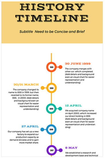
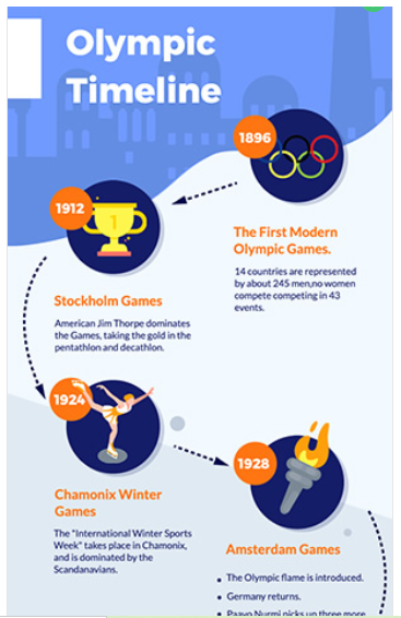
For example, let’s say that you need an infographic on the history of typography. A quick browsing through the available templates can give you an idea: do a timeline presentation. Here are three DesignCap templates that you could use for this purpose:

Once you choose your template, it is easy to change titles, text, colors, backgrounds, symbols, photos, etc. to make the infographic fit your needs. The tool has a drag and drop logic and is pretty intuitive to use.
DesignCap also includes an extensive library of photos, shapes, and backgrounds. This is very handy given that you will probably need to modify some of the images and symbols of the template. The best way to find photos and clipart is to do a search in the library.
If none of their existing assets suits you, you can upload photos and symbols of your own. Uploading is very easy.
And if you don’t feel confident about handling photos and symbols, the tool has simple templates, like the first one, that are generic enough for any use and are mostly based on color and font combinations.
Charts
I usually create charts in Microsoft Excel, but this requires that:
- You know how to use the tool,
- You need to start from scratch, as there are no real templates available,
- You then need to turn your charts into jpeg or png pictures to use them.
Quite some effort—and I know many people who are not familiar with Microsoft Excel.
DesignCap is a great solution if you need to create simple, professional-looking charts, with intricate titles, backgrounds, and a cool design approach, without knowing much about charts and statistics.
I can tell you, even if you know how to create your pie chart or bar chart quickly in Microsoft Excel, you still need some mean graphic design skills to produce something as attractive as the following:


Once you select your template, it is surprisingly easy to add your own data and see the graphs automatically transform. The tool provides you with ready-made, easy-to-update tables, so, as long as you have your data ready in rows and columns, your chart can be ready in minutes.
Here is what the chart editor looks like:

You can either stick to the template or use the editor’s more complex options to change your chart type, modify columns and rows, etc. The chart is modified automatically on the left part of the editor, so you can see immediately how it turns out. Once you select the UPDATE button at the top right of the screen, the new chart will automatically take its designated place on the template.
So, here is what I could easily do in 10 minutes, starting with the above cow template (all numbers are fictitious):

Maps
For the end, I have kept my all-time favorite new DesignCap content: maps.
Have you ever needed to add maps to your posts? For example, where is the best place for summer holidays? (Greece, of course). In which State can find the most bicycle riders? What’s the medium age per State?
How great is it to illustrate the answers with an interactive map? Absolutely great! Until now, however, I had never found an easy way to produce a map to my specifications, color it the way I need it to be colored, make one country stand out, add data to the map, etc.
With DesignCap, you get a Map Editor in the Charts section, which lets you create a map, either for a whole continent, or a specific country. Here is what it looks like:

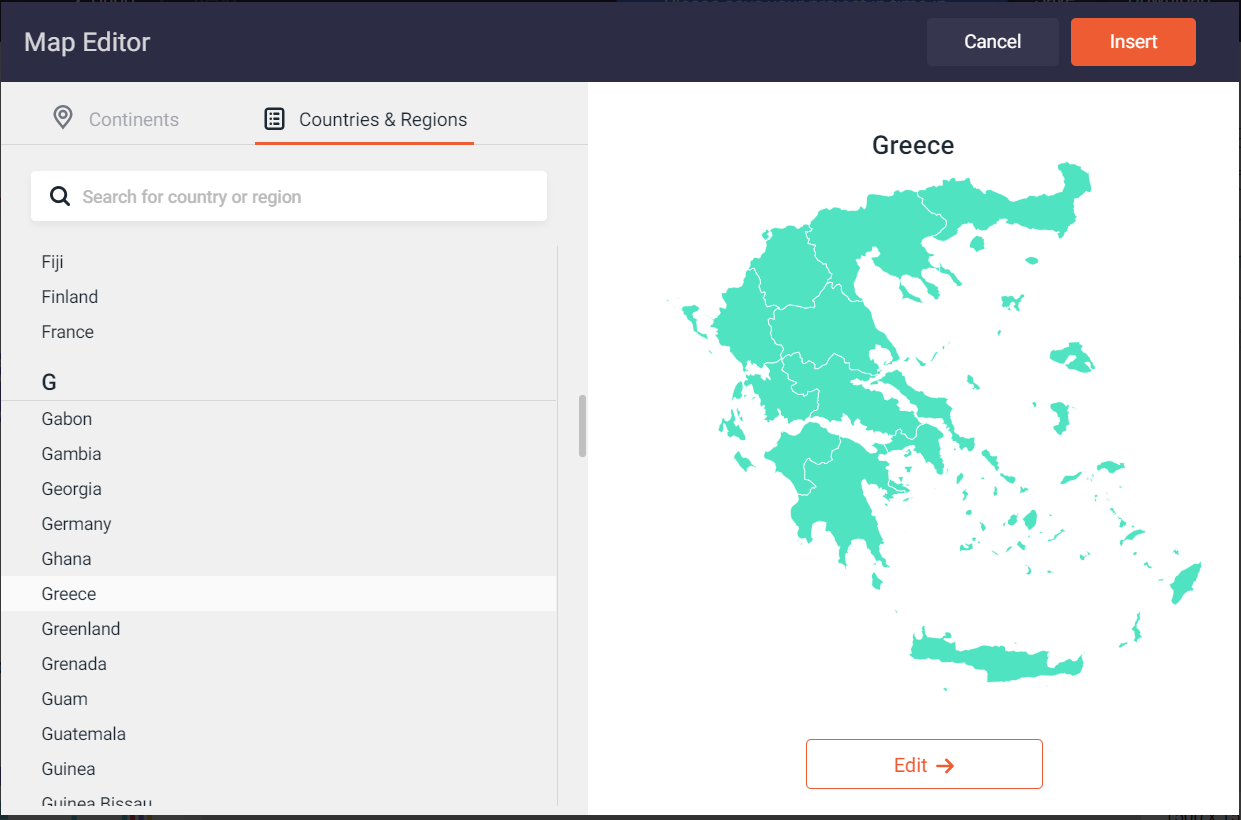
To create your map, you simply select the Edit button. Then you can easily change the color of the map, the color of one or more regions / states / countries, or can add data for the interactive legend that appears when you browse over the map.
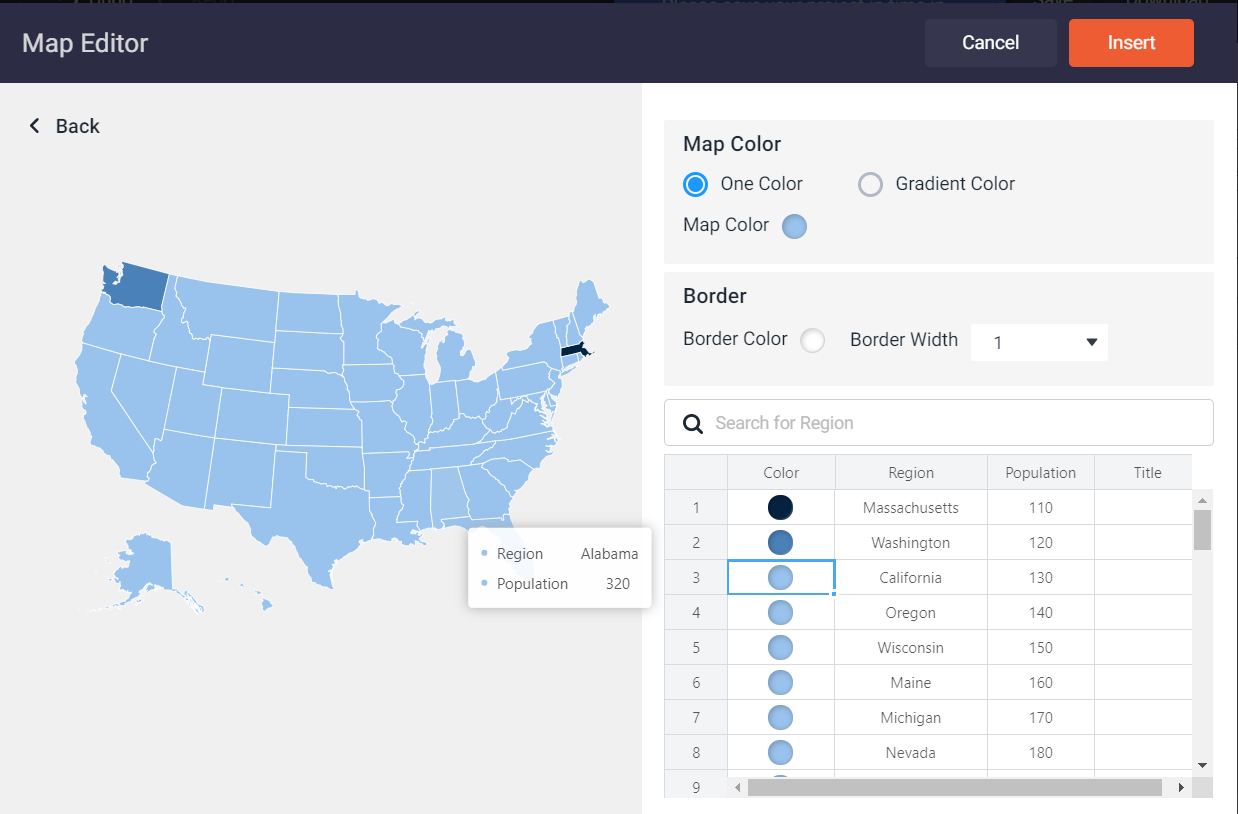
And that’s it. You have a customized, accurate map for your post, article, or book!
My final review
DesignCap is getting better and better. As a tool, it is intuitive to use, and the menus are easy to familiarize with. The stock libraries and their content are also regularly updated and offer a vast choice.
Non-fiction authors, bloggers, and content creators have an extensive free tool to create various visual elements for their work.
I really appreciate that DesignCap has found a way to make easy things that are usually complicated, like infographics, charts, and maps. As they say on their website:
Everyone can design like a pro without a steep learning curve. No skill needed.
You can give the tool a try with their free package, but this means that some of their most beautiful and interesting content is out of reach. So, if you are creating visual content regularly, maybe it is worth taking a paid subscription.
DesignCap offers two paid packages, one for $4.99 a month and one for $5.99 a month. Their only difference is that with the more expensive package you can upload and also save up to 1,000 designs, while the less expensive one saves up to 100 designs. The only drawback is that Paypal is not an acceptable payment method.
And, as I said at the start, leave me a comment for a chance to be one of three visitors who will win a free subscription!


